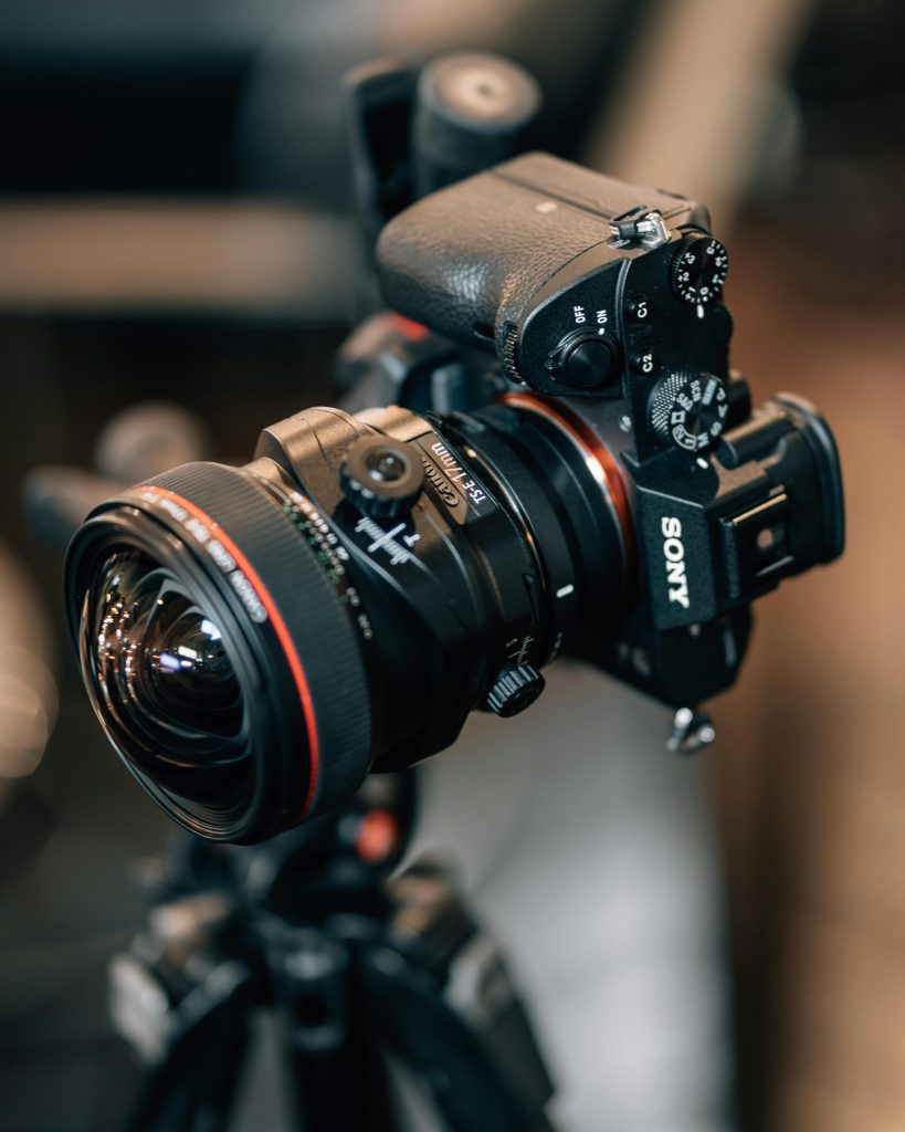
In our photography class, we learn how to handle a camera properly and understand key settings such as exposure, aperture, and shutter speed. Beyond taking photos, we also explore the creative aspects of composition and lighting, and how to capture meaningful moments. An important part of the course is learning how to enhance and edit our images afterwards using digital tools. This combination of technical skills and artistic development allows us to express ourselves visually with confidence and creativity.
“A camera is a tool for learning how to see without a camera.”
– Dorothea Lange
Color Series
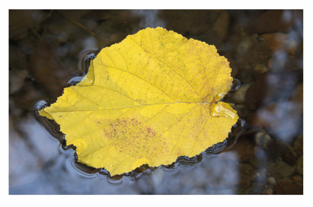
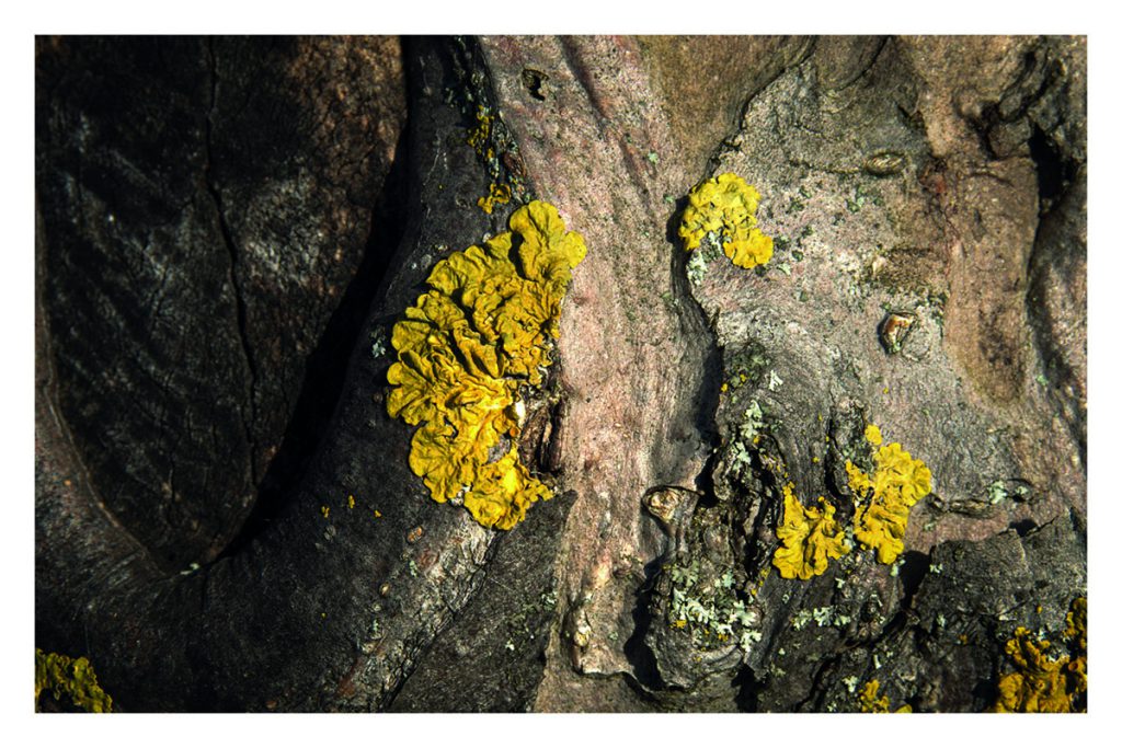
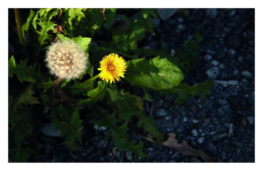
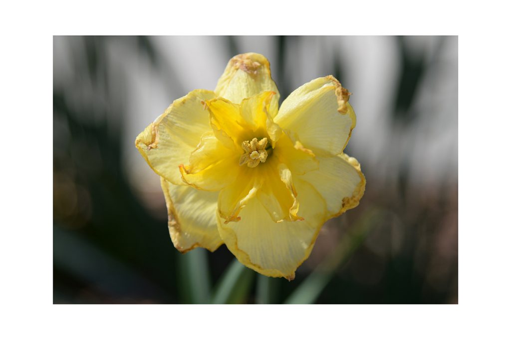
Our first assignment in DGF was to create a series of three images using only one color. The main goal was to become more familiar with the camera and its settings by going outside and observing the environment closely. We were encouraged to focus on composition and visual design rather than the subject itself. I chose yellow as my color, making sure it stands out as the first element the viewer notices. This task helped us train our eye for design and learn how to use the camera more confidently in real situations.
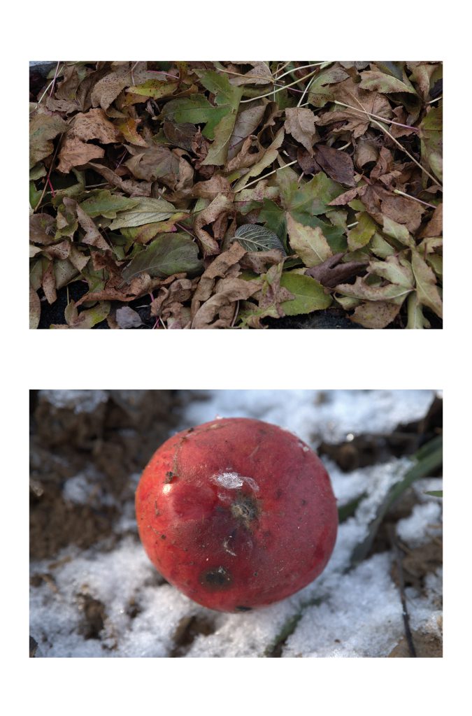
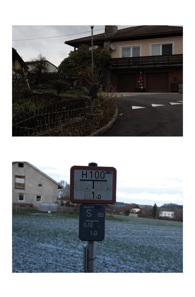
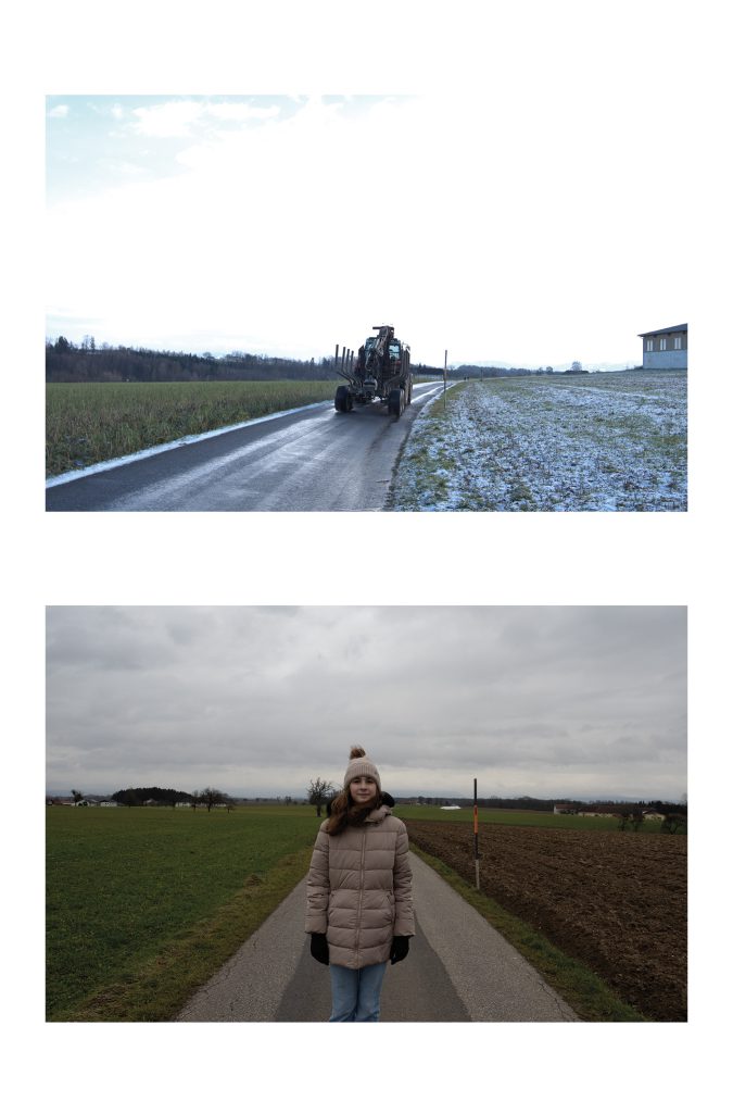
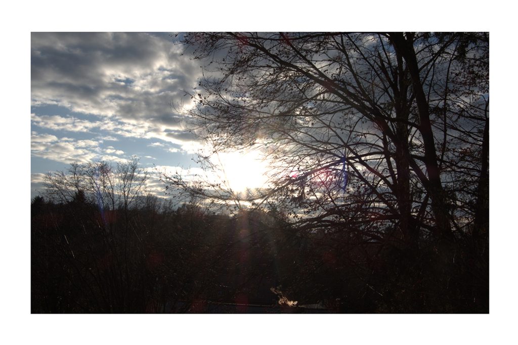
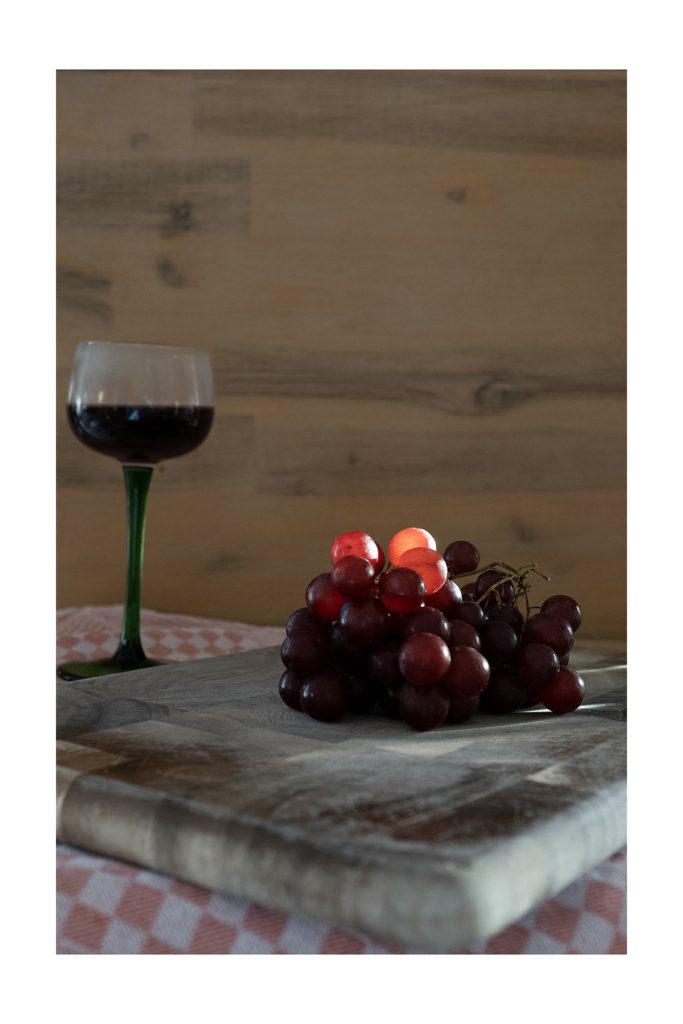
Pairs of Opposite
Our next key assignments in DGF was called “Pairs of Opposites” , a study of visual contrast. We explored how a single image can communicate balance, tension, harmony, or chaos, simply through perspective, depth, color, and motion. From Simple / Ordered to Complex / Chaotic, from Flat to Spatial, and from Static to Dynamic, each photo was an exercise in intention.
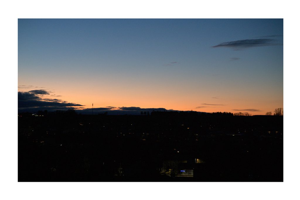
Color Contrast Photography
In this project, each photo was designed to highlight one specific type of color contrast. We explored how colors interact, clash, and complement each other — and how contrast can shape the mood, depth, and focus of an image.
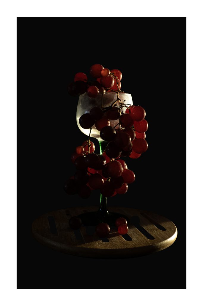
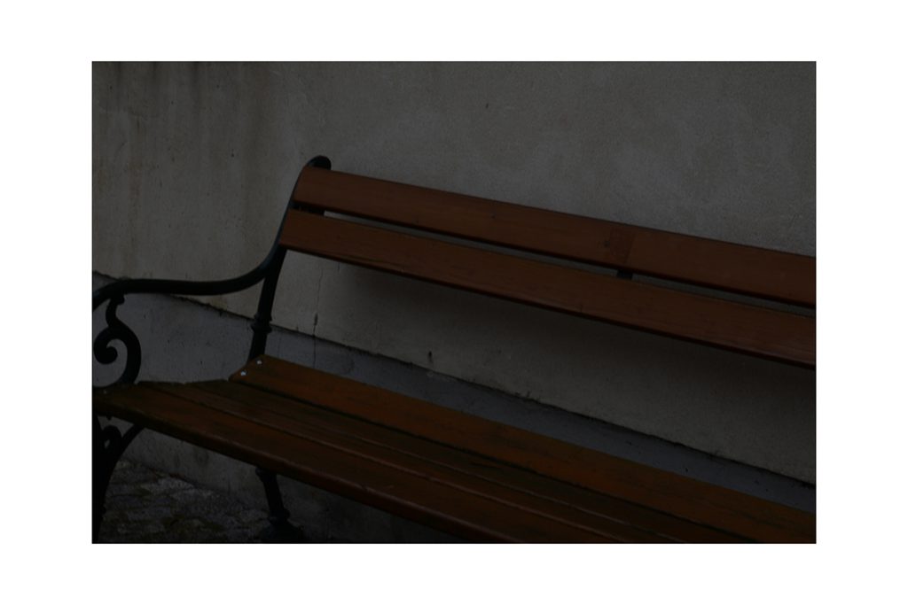
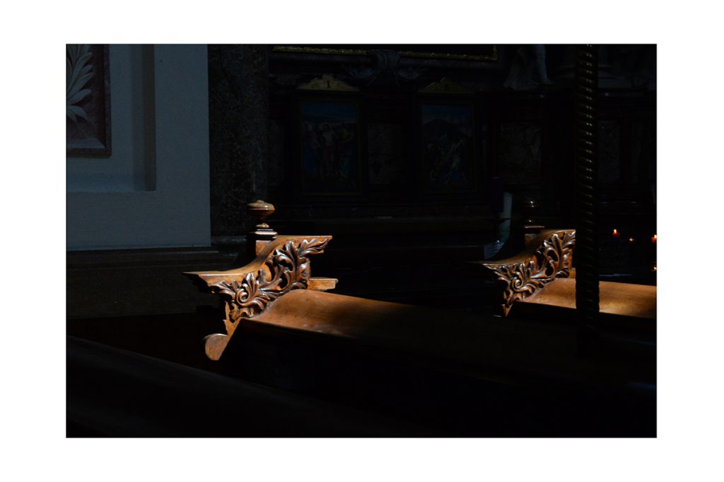
Light–Dark Contrast
High contrast between brightness and shadow. A play of exposure and lighting to emphasize form and structure.
Cool–Warm Contrast
Juxtaposing cool tones (like blue, green) with warm ones (like red, orange) to create emotional depth or tension.
Complementary Contrast
Opposite colors on the color wheel — like blue and orange or red and green — placed together to create visual energy.
Saturation Contrast (Quality Contrast)
Bold, intense colors set against muted or greyed-out ones to draw the eye and create hierarchy in the image.
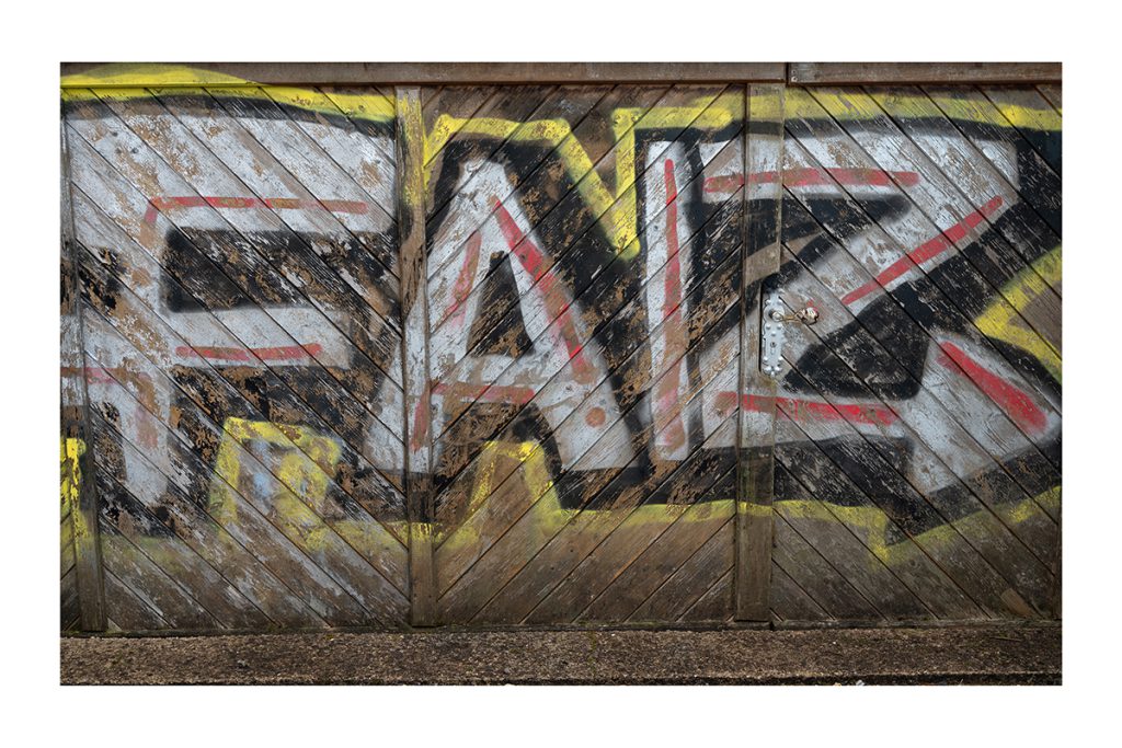
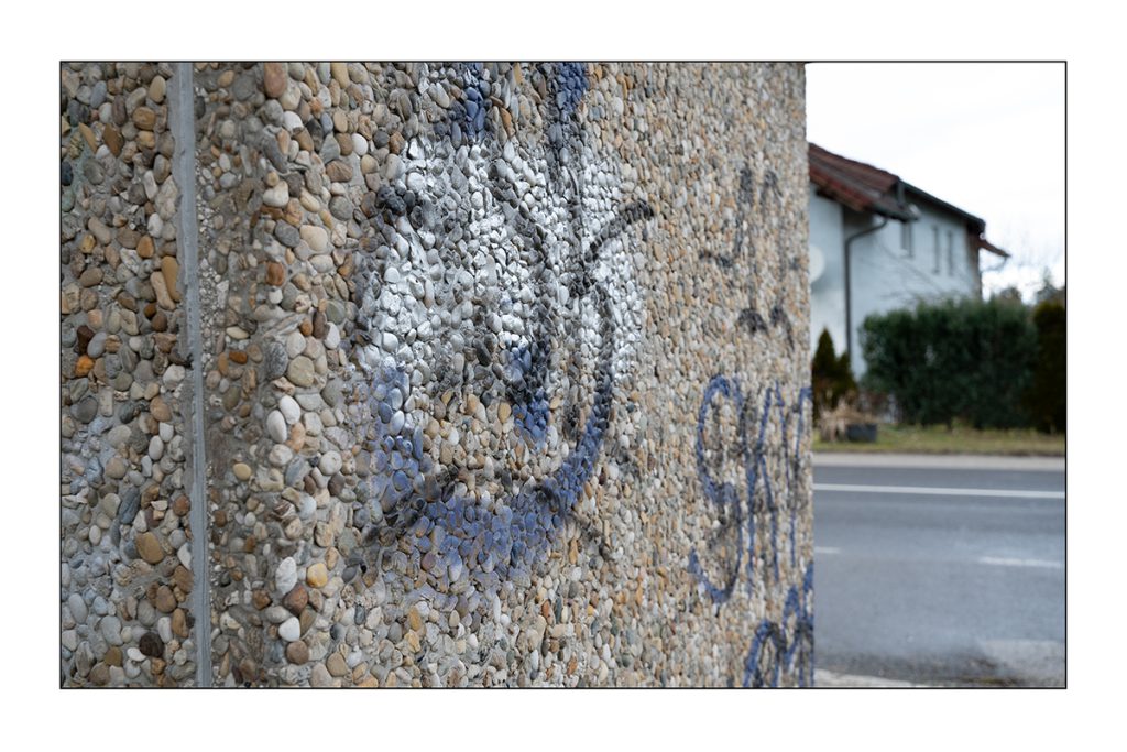
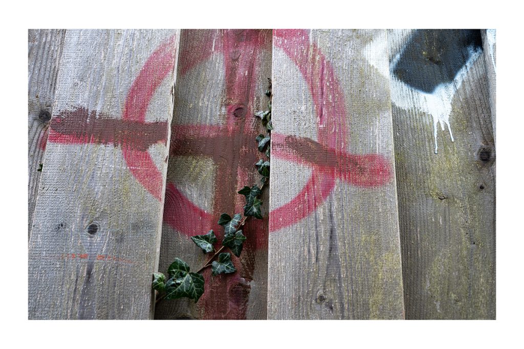
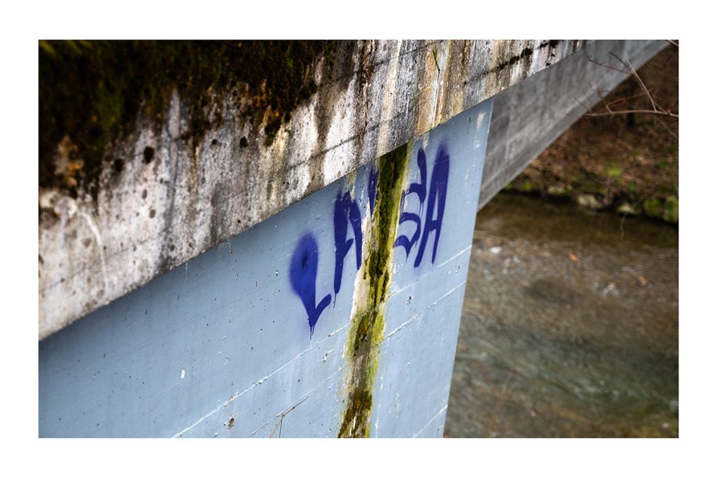
Graffiti – The Art of Expressive Typography
I chose graffiti as my theme because it is a creative art form that impresses through its unique approach to lettering. Graffiti merges art with typography by distorting, stylizing, and often making letters difficult to read. It not only serves an informational purpose but also unfolds a strong visual impact. Furthermore, it reflects social and personal messages and transforms public spaces. The combination of expression, lettering, and meaning fascinates me and inspired me to explore this topic.
“You don’t take a photograph, you make it.”
– Ansel Adams
In the second semester, we also had several practical assignments in photography. These tasks helped us explore different genres and techniques.
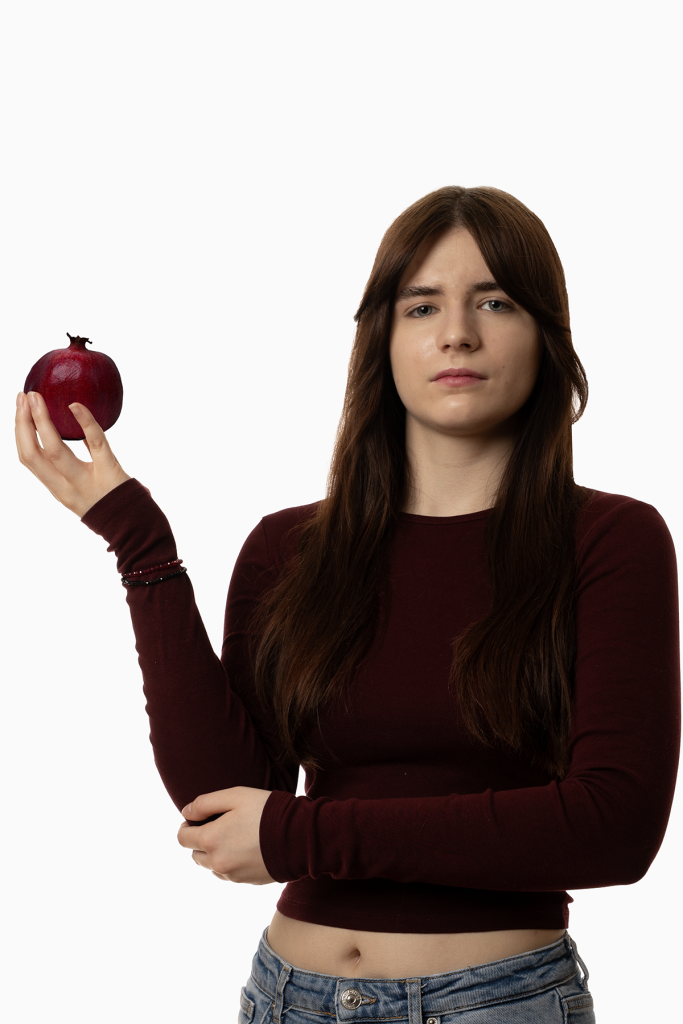
1. Staged Portrait
2. Product Photography
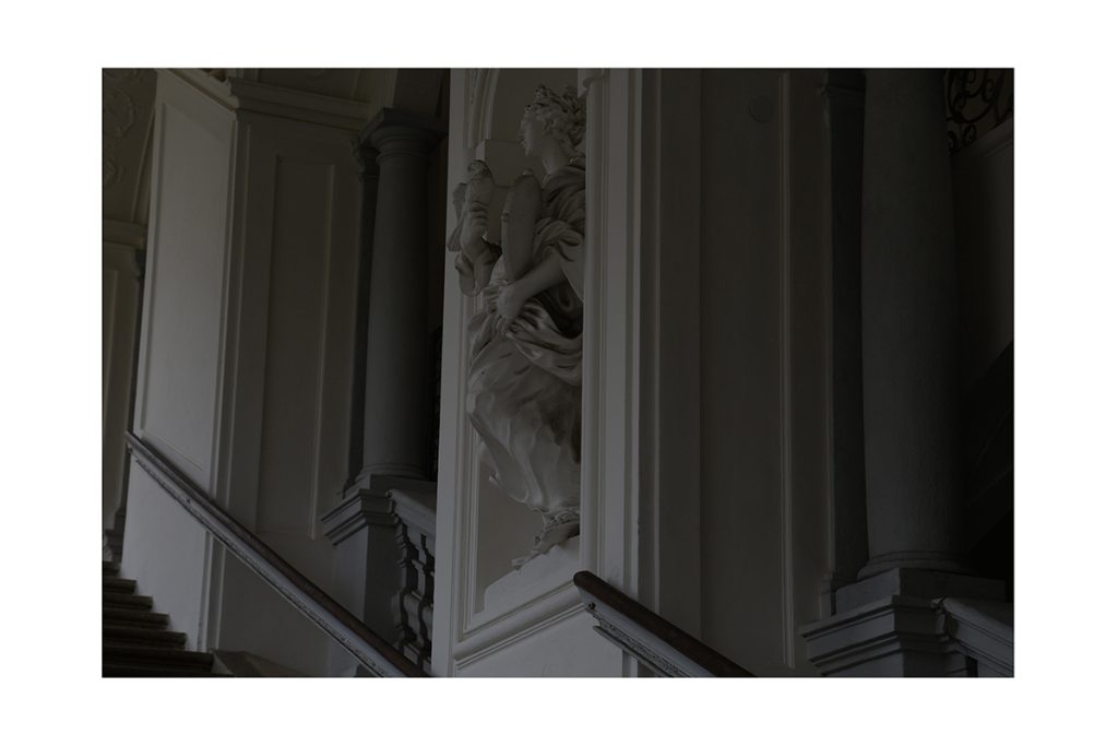
3. Architectural Photography
4. Macro Photography
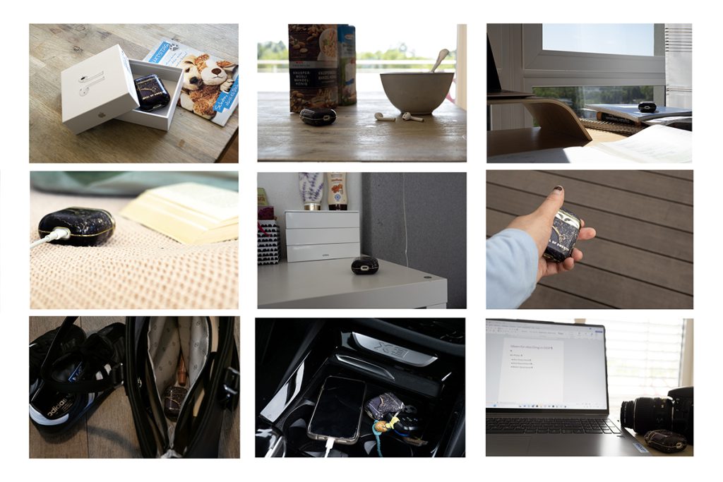
5. The Object – My Constant Companion
6. Free Project
Staged Portrait
Product Photography
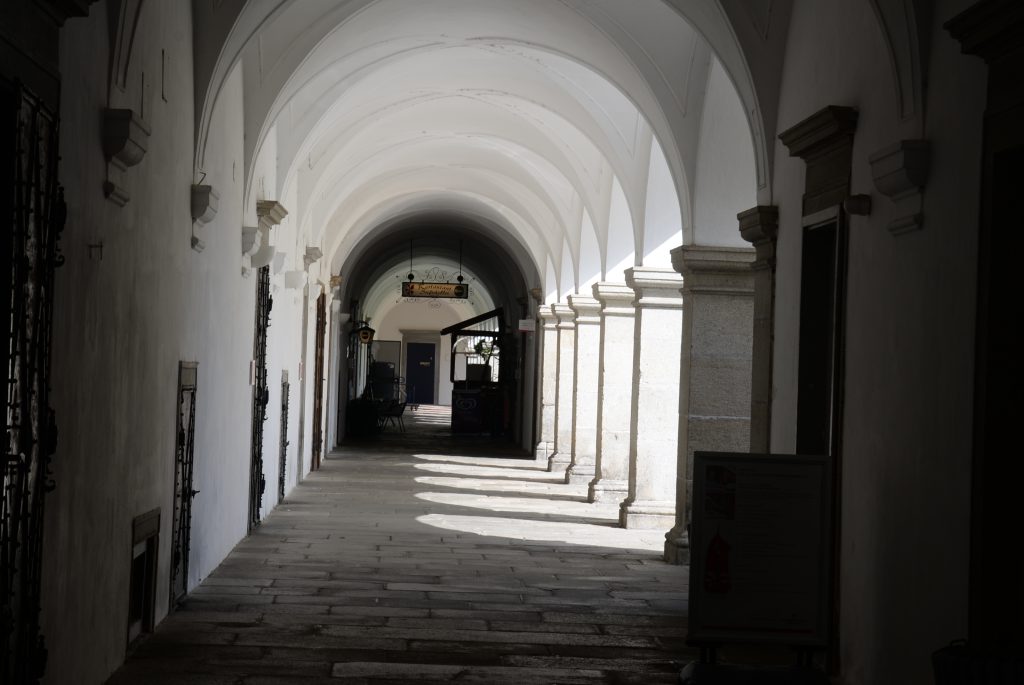
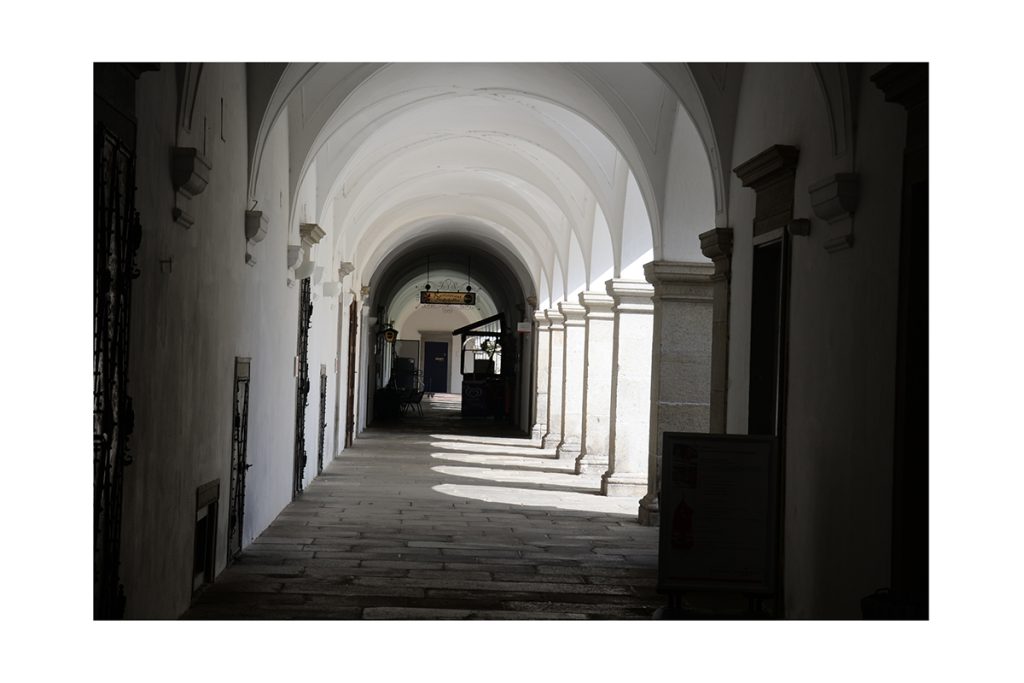
Architectural Photography

Macro Photography
The Object – My Constant Companion
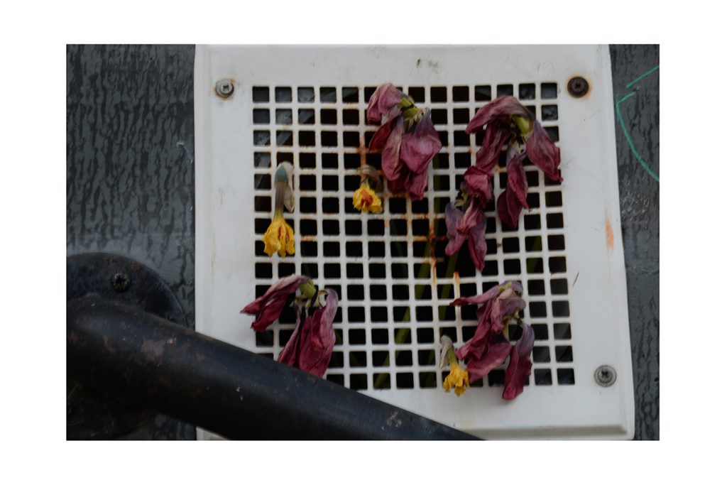
Free Project (Feelings)
“Photography is the story I fail to put into words.”
— Destin Sparks